How to Choose Blind Colours: Walls, Trim, Floors and the View From the Street
Colour is the choice people agonise over most, and it's simpler than it looks. Start with the trim, think about the light, and remember the view from the street.
In short
- Matching the trim makes blinds disappear; matching the walls makes them blend.
- Light fabrics brighten rooms and reflect heat; dark fabrics give clearer views.
- From outside, one backing colour across the house looks cleanest.
- Always judge samples in your own light, at the window.
On this page
Start with the trim
If your window trim is white, white and off-white fabrics make the blinds disappear into the frame, which is the calmest look. If your frames are black, see blinds for black window frames.
Match the walls to blend
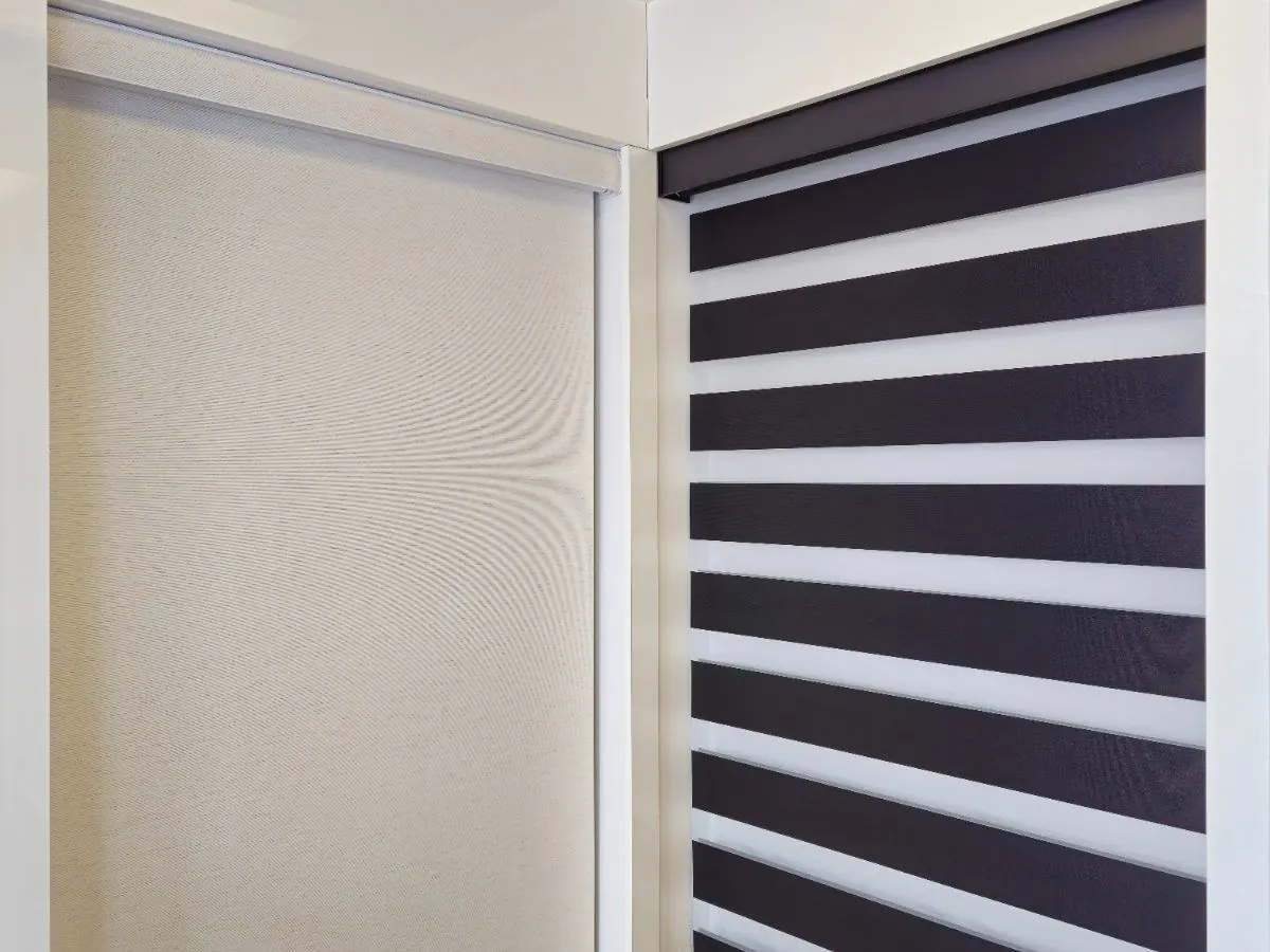
A fabric close to the wall colour makes the blind part of the wall when it's down. Greys, linens and warm whites cover most painted walls. It's the safest choice for rooms where you want the furniture, art or view to be the focus.
Contrast on purpose
A darker or bolder blind can anchor a room, especially against light walls. If you go for contrast, keep it consistent: the same colour on every window in the room.
How colour changes light, view and heat
- Light fabrics let rooms feel brighter and reflect more of the sun's heat back out the window.
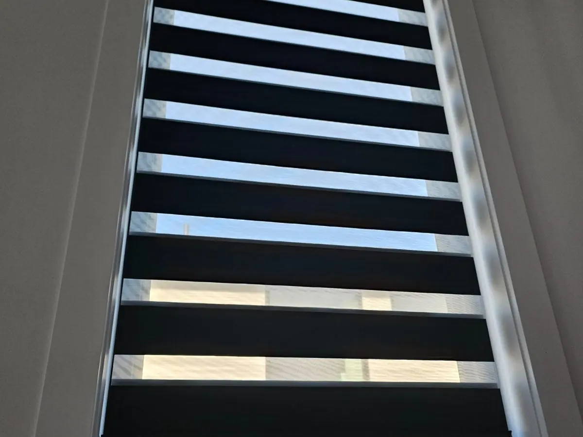
- Dark fabrics absorb more heat, but in screen shades they give the sharpest view out and the least glare.
- Mid-tones such as greys and taupes hide dust and fingerprints best.
See roller shade fabrics explained for how colour affects screen fabrics.
The view from the street
From outside, every shade in the front of the house is seen together. If each room has a different colour, the house can look patchy. Two fixes: choose fabrics with the same backing colour (many fabrics have a white or neutral back), or keep one colour family across the front rooms. Many condo buildings require a uniform colour facing out; see Windsor condos and apartments.
One colour for open-concept floors
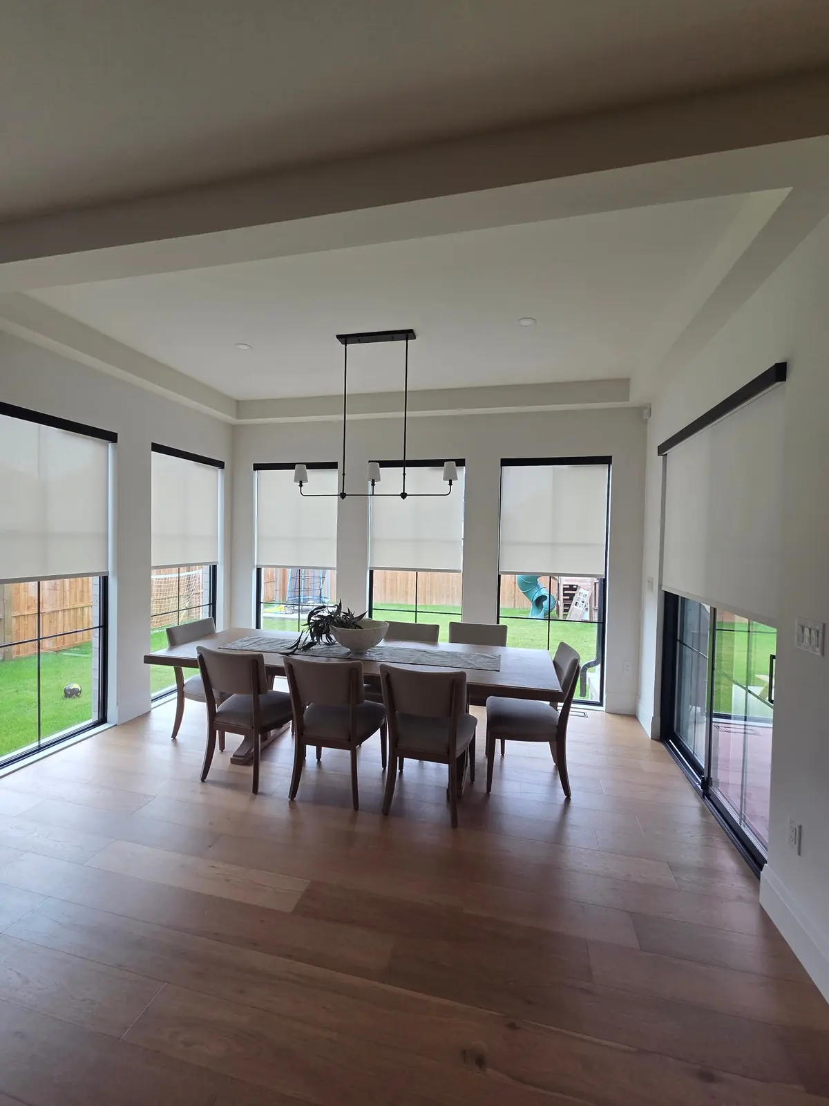
When you can see the kitchen, dining room and family room at once, use one fabric colour and one cassette finish across them. Bedrooms upstairs are free to differ.
Pattern and texture
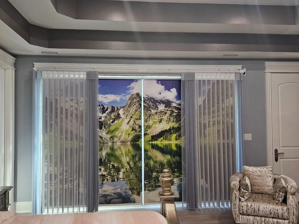
Textured weaves and linen looks add warmth without strong colour. Patterns and prints work best as a feature on one window or one room, like a printed roller shade on a patio door.
Judge samples in your own light
Fabric looks different under store lights, in the morning and at sunset. That's why we bring samples to your home and hold them up at the actual window. See what to expect at the consultation.
Common questions
Should blinds be lighter or darker than the walls?
Usually the same or lighter, so they blend in. Darker blinds work when you want them as a feature, or for screen shades where a dark colour gives a clearer view.
What colour blinds look best from outside?
A consistent one. White or neutral backings across the front of the house look cleanest; dark fabrics look neat against black frames.
Do all rooms need the same colour?
Rooms you see together, and windows that face the street, should match. Other rooms can be chosen on their own.